

All HTML elements can be considered as boxes and understanding these boxes makes it easy to create a layout with CSS. In CSS we have several types of boxes that are generalized into default categories as BLOCK and Inline boxes. It is categorized based on the flow of the page and its relationship with other boxes.
Boxes have an Inner display and an Outer display, where the inner display which defines how elements should be structured inside the box. Outer display defines how the box is structured on the page relative to adjacent boxes.
Outer-Display: block
If Outer-display type is a block then the box breaks into a new line and consumes the whole line of the page by taking up 100 % of the width available**. By using Margin and Padding other boxes will be pushed away.
Outer-Display: inline
If Outer-display type is inline then the box will not start on a new line and consume the width as required by the content. The top and bottom properties of Margin and Padding cannot be applied but the left and right properties will have an impact.
Inline Display type
It defines how elements inside a box are defined. All the element inside a box is also considered as a box. By default, elements behave as normal flow, i.e block or inline. There are also additional properties like
flex,grid, etc which is a different way of structuring boxes.
Some elements like <h1>, <p> are block-level elements. While <a>, <span> are inline elements.
What is Box-Model?
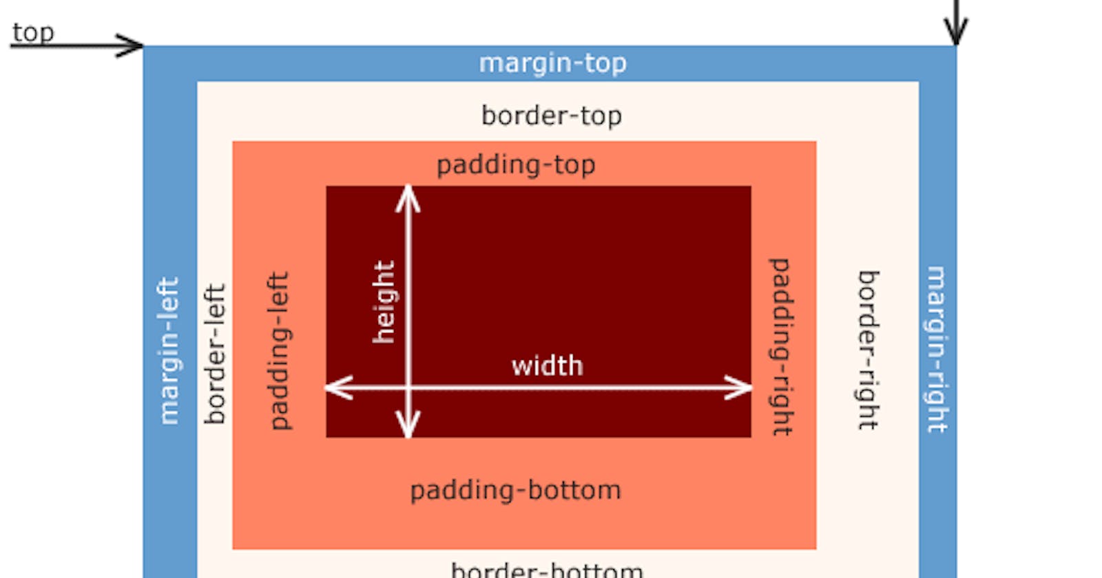
CSS Box-Model is the implementation of elements as a box and having features like margin, border, padding and content. Features of box-model are completely used by block-level elements and partially used by inline elements.
Parts of Box-Model
Content-box: The area where content like text, image, video, etc may be displayed.
Padding-box: The area around the content is called Padding. Padding-box wraps the content-box.
paddingproperty is used to define padding-related styling. It is like a breathable space around the content.Border-box: The area that goes around the padding is called Border. Border-box wraps the content-box and padding.
borderproperty is used to define border-related styling. It is like the fence around the content. It helps developers to detect where does box lies and what distance from the border lies content. Knowing this he can bring out the required design into implementation.Margin-box: The area outside the border is called Margin. Margin-box wraps the content-box, padding-box and border-box.
margin:property is used to define margin related styling. It is usually used to set relative distance from other boxes.
There are Standard Box-Model and Alternate Box-Model. By default browser uses Standard Box-Model. The box-sizing property defines how the width and height of an element are calculated: should they include padding and borders, or not.
Standard Box-Model
Box-sizing is the property that sets the total width and height of the box. By default width and height are applied to content-box of the element. When you set extra padding and border, it adds to the total width of the box. This Box-sizing property is known as
content-box(default)..box { width: 100px; height: 100px; margin: 10px; padding: 10px; border: 10px solid black; }
Total width consumed by .box is (100 + (10\2) + (10*2)) 140px\,* i.e width + padding-left + padding-right + border-left + border-right.
Similarly total height is (100 + (10\2)+ (10*2) + (10*2)) 140px, i.e height + margin-top + margin-bottom + padding-top + padding-bottom + border-top + border-bottom.*
If you set the width of an element to 100 pixels, then the element's content-box will be 100 pixels wide, and the width of any border or padding will be added to the final rendered width, making the element wider than 100px.
Alternate Box-Model
Here any width and height applied is a visible box on the page. The width of the content area is the total width - (padding + border). We used
box-sizing: border-boxfor alternative box model.box { width: 100px; height: 100px; margin: 10px; padding: 10px; border: 10px solid black; box-sizing:border-box; }Total width consumed by
.boxis (100 + (10\2) + (10*2)) 140px, i.e width + padding-left + padding-right + border-left + border-right.*Similarly total height is (100 + (10\2) + (10*2)) 140px, i.e height + + padding-top + padding-bottom + border-top + border-bottom.*
If you set the width as 100px, it will include padding and border. The total width of the element will be 100px only. But content-box will shrink its size to absorb the Extra width.